Logo Score Index · #178 of 487
Peugeot Logo Analysis
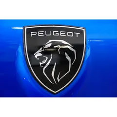
Peugeot's powerful lion emblem commands recognition and trust, but its color contrast issues hinder universal accessibility.
Automotive · 1 point above the Automotive average of 83 (76 logos)
The verdict
The Peugeot logo projects strong authority and trust, scoring exceptionally well across credibility and recognition metrics, which is vital for brand equity in the automotive sector. However, its current color contrast presents an accessibility challenge that could limit market reach. Addressing this technical design flaw will reinforce its professional standing and ensure broader appeal without compromising its powerful visual identity.
Score breakdown
How the Peugeot logo scores across the analysis categories.
- Design89
- Psychology82
- Trust92
- Cognitive90
- Market85
- Typography90
- Color59
- Cultural88
Strengths and weak spots
What works
The logo's primary strengths lie in its strong brand recognition, clear communication of power and modernity through its lion emblem and sleek design, and its high memorability. It effectively conveys trust and professionalism, aligning well with the automotive industry's expectations. The design is highly scalable and adaptable across various platforms.
Where it could improve
Key areas for improvement include its WCAG color contrast ratio, which currently fails accessibility standards, potentially limiting its reach. While culturally safe, there's an opportunity to enhance emotional warmth to broaden appeal beyond pure competence and sophistication. The design, while modern, could explore subtle elements to increase uniqueness within a competitive market.
If this were your logo, we'd suggest
- Improve WCAG Color Contrast for Text
- Refine Color Palette for Broader Emotional Appeal
- Explore Subtle Dynamic Elements
- Conduct Targeted Cultural Market Research
What the analysis found
Positioning
The logo's modern, geometric lion within a shield effectively positions Peugeot as a brand of strength, heritage, and contemporary design. Its distinctiveness and clear industry fit ensure it stands out in the competitive automotive landscape, signaling both tradition and innovation.
Trust
The clean lines, professional sans-serif typography, and the symbolic strength of the lion contribute to a high trust score. The blue background, even if not part of the core logo, reinforces reliability and stability, fostering a strong sense of credibility and a positive first impression.
Recognition
The highly stylized and unique lion emblem, combined with clear typography, ensures excellent recognition speed and memorability. Its simplicity and strong visual hierarchy make it easy to process, allowing for quick identification even at a glance, which is crucial for brand recall.
Emotion
The logo evokes emotions of power, confidence, and protection through the lion and shield imagery. While strong in conveying competence, the monochromatic palette and sharp angles lean towards sophistication rather than warmth, suggesting a more aspirational than intimately connected emotional appeal.
Design
The design demonstrates high harmony and symmetry, with a balanced composition and effective use of negative space that enhances visual clarity. Its geometric precision and scalability are strong assets, though the WCAG contrast ratio for text within the logo is a notable design flaw requiring attention.
Brand personality
The Peugeot logo strongly projects 'Competence' (90) through its precise geometric design, clean typography, and the powerful, authoritative imagery of the lion. It conveys reliability, intelligence, and success, fitting for an established automotive brand. 'Excitement' (75) is also present, driven by the dynamic pose of the lion and the sleek, modern aesthetic, suggesting a brand that is up-to-date and spirited. 'Sophistication' (70) is evident in the monochromatic palette and elegant lines. 'Sincerity' (30) and 'Ruggedness' (40) are less pronounced, as the design prioritizes sleekness and precision over earthiness or toughness.
The Peugeot logo strongly embodies 'The Ruler' archetype. The lion, a symbol of majesty, power, and leadership, combined with the shield emblem, conveys authority, control, and established dominance. The sleek, modern design and high contrast suggest a brand that is sophisticated, successful, and in command of its domain, aiming to provide a sense of security and prestige to its customers.
Color and typography
The primary blue background evokes feelings of trust, stability, and professionalism, aligning well with a reliable automotive brand. The black and white/silver of the logo itself convey sophistication, power, and modernity. This combination creates a strong, confident, and somewhat serious emotional tone, emphasizing competence and prestige.
The bold, uppercase sans-serif font perfectly matches the brand's personality of strength, modernity, and precision. It conveys a sense of reliability and forward-thinking, aligning seamlessly with the automotive industry's need for clear, confident communication.
Explore the full Peugeot scorecard
Every metric behind the 84/100 — attention prediction, color harmony, typography and more, in the interactive report.
More from the index


Independent analysis. Logo Analyzer is not affiliated with or endorsed by Peugeot; all trademarks and logos belong to their respective owners. Scores and commentary reflect one AI model's assessment of the logo's design and are not an official ranking, endorsement, or measure of brand or commercial success.