Logo Score Index · #387 of 487
Lenovo Logo Analysis
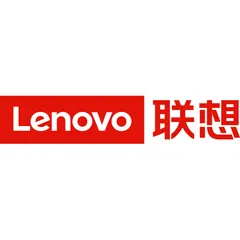
Lenovo's logo commands attention and trust through bold simplicity, yet its emotional depth could be enhanced to foster stronger customer loyalty.
Technology · 4 points below the Technology average of 82 (89 logos)
The verdict
The Lenovo logo effectively projects competence and reliability, establishing a strong foundation of trust and recognition in the technology market. However, its emotional engagement is somewhat limited, potentially hindering deeper brand loyalty. Strategic adjustments to broaden its emotional appeal could unlock greater market resonance without compromising its established professional image.
Score breakdown
How the Lenovo logo scores across the analysis categories.
- Design89
- Psychology78
- Trust83
- Cognitive89
- Market71
- Typography88
- Color61
- Cultural71
Strengths and weak spots
What works
The logo's top strengths include its high memorability due to strong color contrast and simplicity, excellent scalability and adaptability across various media, and a clear alignment with the technology industry. Its professional and competent appearance fosters trust, and the bold red color ensures strong attention capture.
Where it could improve
Areas for improvement include the very low WCAG contrast ratio, which significantly impacts accessibility for visually impaired users. The logo's emotional impact, while strong in terms of energy, could be broadened to include more nuanced positive emotions beyond urgency. Additionally, its cultural sensitivity score is moderate due to potential negative associations of red in some regions.
If this were your logo, we'd suggest
- Improve Color Contrast for Accessibility
- Explore Broader Emotional Palette
- Conduct Targeted Cultural Testing
- Refine Typography for Modernity
What the analysis found
Positioning
The logo's clean, modern sans-serif typography and bold red color effectively position Lenovo as a contemporary and authoritative player in the technology industry. Its simplicity and directness convey a focus on core functionality and innovation, aligning well with industry expectations for clarity and efficiency.
Trust
The geometric precision of the font and the structured rectangular form contribute significantly to a perception of competence and reliability, which are crucial for building trust in a technology brand. The clear, unambiguous presentation fosters a sense of professionalism and dependability, leading to a strong first impression.
Recognition
The high contrast between the white text and red background, combined with the logo's simple and distinct shapes, ensures rapid recognition and high memorability. The bold color choice and clear typography make it easily identifiable across various platforms and sizes, aiding in quick brand recall.
Emotion
The dominant red color evokes strong emotions of energy, passion, and urgency, which can be motivating and dynamic. However, the emotional range is somewhat narrow, primarily focusing on intensity rather than warmth or approachability, which could limit deeper emotional connection with a broader audience.
Design
The logo demonstrates strong design principles with high symmetry and good figure-ground balance, contributing to perceptual harmony. Its minimalist approach ensures excellent scalability and adaptability, making it versatile for various applications. The simplicity also results in low visual complexity, aiding processing fluency.
Brand personality
The Lenovo logo strongly embodies 'Competence' (90/100) through its clean, geometric sans-serif typography and structured rectangular form, conveying reliability, intelligence, and success—qualities essential for a tech brand. 'Excitement' (70/100) is also present due to the bold, vibrant red color, suggesting dynamism and being up-to-date. However, 'Sincerity' (30/100) is low as the design is not earthy or wholesome. 'Sophistication' (45/100) is moderate; while clean, it lacks the luxurious or charming elements. 'Ruggedness' (20/100) is minimal, as the design is far from outdoorsy or tough.
The logo aligns with 'The Creator' archetype through its emphasis on innovation, technology, and the development of new solutions. The clean, modern design and the association with a leading tech brand suggest a focus on ingenuity and bringing new ideas to life. The bold, direct presentation implies confidence in its creations.
Color and typography
The dominant red color evokes strong emotions of energy, passion, and urgency. It is highly stimulating and attention-grabbing, creating a sense of dynamism and importance. While it can convey power and excitement, its intensity might also be perceived as aggressive or demanding by some, limiting a broader range of positive emotional connections like warmth or calm.
The bold, geometric sans-serif font perfectly matches Lenovo's brand personality as a technology leader. It conveys modernity, precision, and competence, aligning with the industry's values of innovation and reliability. The clean lines and strong presence reinforce the brand's authoritative and forward-thinking image.
Explore the full Lenovo scorecard
Every metric behind the 78/100 — attention prediction, color harmony, typography and more, in the interactive report.
More from the index


Independent analysis. Logo Analyzer is not affiliated with or endorsed by Lenovo; all trademarks and logos belong to their respective owners. Scores and commentary reflect one AI model's assessment of the logo's design and are not an official ranking, endorsement, or measure of brand or commercial success.