Logo Score Index · #290 of 487
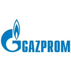
Gazprom Logo Analysis
The Gazprom logo effectively signals competence and stability but lacks emotional depth, hindering broader appeal.
Telecommunications · 1 point below the Telecommunications average of 82 (17 logos)
The verdict
Your logo projects strong authority and trust, scoring exceptionally well across credibility metrics, which is vital for a global energy provider. However, its emotional engagement lags behind expectations, potentially limiting deeper connections with stakeholders. Consider introducing subtle design enhancements to bridge this gap without sacrificing the professional foundation.
Score breakdown
How the Gazprom logo scores across the analysis categories.
- Design89
- Psychology71
- Trust89
- Cognitive86
- Market72
- Typography93
- Color59
- Cultural93
Strengths and weak spots
What works
The logo's primary strengths lie in its strong brand recognition and professional credibility, driven by its clear, bold typography and iconic flame symbol. Its high cultural sensitivity and global appeal, largely due to the universally positive associations of blue, ensure broad acceptance. The design's simplicity contributes to good memorability and scalability, making it effective across various applications.
Where it could improve
Key areas for improvement include the critical color contrast ratio, which fails WCAG standards and impacts accessibility. The logo's emotional impact could be enhanced to foster deeper connections, as its current design leans heavily on competence and authority. While highly symmetrical, a slight increase in dynamism could prevent it from appearing overly static, and its differentiation index could be boosted to stand out more distinctly in a competitive energy landscape.
If this were your logo, we'd suggest
- Improve Color Contrast for Accessibility
- Enhance Emotional Engagement
- Refine Icon-Wordmark Integration
- Explore Dynamic Variations for Digital Use
What the analysis found
Positioning
The logo's bold, industrial aesthetic and iconic flame clearly position Gazprom as a powerful and essential energy provider. Its strong, no-nonsense design aligns with a global utility, though it could benefit from subtle updates to appear more forward-thinking and less purely traditional in a rapidly evolving energy market.
Trust
The deep blue color and robust, sans-serif typography instill a high degree of trust and professionalism. The symmetrical and balanced composition further reinforces reliability and stability, making the brand appear dependable and credible to stakeholders and partners.
Recognition
The distinctive 'G'-flame icon combined with the all-caps wordmark ensures high recognition speed and memorability. Its simplicity and clear visual hierarchy make it easily identifiable across various media, contributing to strong brand recall even at a glance.
Emotion
While the logo evokes feelings of security and competence through its blue color and strong forms, its emotional impact is somewhat limited. It primarily appeals to rational trust rather than fostering deeper emotional connections, which could be a missed opportunity for broader public engagement.
Design
The design demonstrates strong harmony and symmetry, with a clear figure-ground balance and effective use of negative space. Its scalability is excellent due to its simplicity. However, the critical color contrast issue is a significant design flaw that impacts accessibility and overall visual quality.
Brand personality
The Gazprom logo strongly embodies the 'Competence' personality, scoring 90. This is evident in its professional blue color, robust sans-serif typography, and clean, precise design. It communicates reliability, intelligence, and success, fitting for a major energy corporation. 'Sincerity' (60) is present through its straightforwardness, but not dominant. 'Sophistication' (65) is suggested by its sleekness, but it lacks the ornate details often associated with it. 'Excitement' (40) is low due to its conservative and stable nature, while 'Ruggedness' (30) is minimal, as the design is polished rather than raw or outdoorsy.
The Gazprom logo embodies 'The Ruler' archetype through its strong, authoritative presence. The bold, all-caps typography, combined with the stable and professional blue color, conveys power, control, and leadership. The iconic flame, while symbolizing energy, also suggests a dominant force in its domain. The overall design communicates a sense of established order, reliability, and a commanding position in the market, aligning with the Ruler's desire for control and responsibility.
Color and typography
The blue color primarily evokes feelings of trust, stability, and professionalism. It creates a sense of calm and security, which is beneficial for a utility company. However, its emotional impact is more on the rational side, fostering confidence rather than strong emotional arousal or warmth.
The bold, geometric sans-serif font perfectly matches the brand's desired personality of competence, stability, and authority. It conveys a sense of strength and reliability, aligning well with a major energy corporation. The clean lines and all-caps presentation reinforce professionalism and seriousness.
Explore the full Gazprom scorecard
Every metric behind the 81/100 — attention prediction, color harmony, typography and more, in the interactive report.
More from the index


Independent analysis. Logo Analyzer is not affiliated with or endorsed by Gazprom; all trademarks and logos belong to their respective owners. Scores and commentary reflect one AI model's assessment of the logo's design and are not an official ranking, endorsement, or measure of brand or commercial success.