Logo Score Index · #324 of 487
Donkervoort Logo Analysis
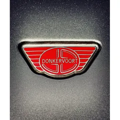
This logo powerfully conveys heritage and performance but risks appearing dated, hindering broader market appeal.
Automotive · 3 points below the Automotive average of 83 (76 logos)
The verdict
The Donkervoort logo projects strong competence and a premium image, aligning well with the brand's high-performance automotive positioning. While it effectively captures attention and builds trust, there's an opportunity to modernize its aesthetic to resonate more broadly with evolving consumer tastes. Strategic updates could enhance market appeal without compromising its established heritage.
Score breakdown
How the Donkervoort logo scores across the analysis categories.
- Design78
- Psychology73
- Trust90
- Cognitive80
- Market81
- Typography75
- Color70
- Cultural90
Strengths and weak spots
What works
The logo's top strengths include its strong alignment with the automotive industry, high perceived professional credibility, and excellent harmony and symmetry. The vibrant red color effectively conveys passion and performance, while the metallic finishes contribute to a premium perception. Its cultural safety score is also very high, indicating broad acceptance.
Where it could improve
Areas for improvement include the color contrast ratio, which fails WCAG standards, potentially impacting accessibility and readability. The overall aesthetic, while classic, could be perceived as somewhat dated by certain demographics. Scalability and adaptability could be enhanced by simplifying some of the intricate details for smaller applications. The attention spread is quite diffuse, suggesting opportunities to guide focus more effectively.
If this were your logo, we'd suggest
- Improve Text Contrast for Accessibility
- Modernize Emblem Details for Freshness
- Optimize for Small-Scale Applications
- Enhance Visual Focus within Emblem
What the analysis found
Positioning
The logo's classic emblem style, vibrant red, and metallic finish strongly position Donkervoort as a premium, performance-oriented automotive brand. The wing motif and robust design align perfectly with the industry's emphasis on speed and engineering. However, its intricate details and traditional aesthetic might be perceived as less cutting-edge compared to more minimalist, futuristic designs in the market.
Trust
The logo's high symmetry, professional execution, and metallic appearance contribute significantly to a perception of reliability and quality, fostering trust. The clear brand name and established emblem style signal a reputable and enduring brand. The strong industry fit further reinforces its credibility within the automotive sector.
Recognition
The distinctive shield/wing shape and the bold red color make the logo highly recognizable. Its complexity, while high, is balanced by strong symmetry, aiding recall. However, the diffuse attention spread suggests that while the logo is seen, specific elements might not immediately 'stick' as primary identifiers, potentially slowing down instant recognition compared to simpler marks.
Emotion
The vibrant red color evokes strong emotions of excitement, passion, and power, aligning with the thrill of high-performance driving. The metallic sheen adds a sense of luxury and aspiration. The overall design, with its dynamic elements, creates an emotional connection to speed and achievement, resonating with the 'Hero' archetype.
Design
The logo demonstrates excellent harmony and symmetry, creating a visually pleasing and balanced composition. The use of an embossed effect and metallic outlines adds depth and a premium feel. However, the intricate details and low color contrast for text elements present challenges for scalability and accessibility, particularly in smaller digital formats.
Brand personality
The Donkervoort logo primarily embodies 'Competence' with a strong secondary 'Excitement'. Its geometric precision, metallic finish, and clear, sans-serif typography for 'DONKERVOORT' convey reliability, intelligence, and success, aligning with the competence dimension. The vibrant red color and dynamic wing elements, however, inject a significant amount of excitement, suggesting daring, spirited, and up-to-date qualities. Sophistication is moderately present due to the premium materials and classic emblem style, while Sincerity and Ruggedness are less prominent, as the design is not earthy, wholesome, or overtly tough/outdoorsy.
The Donkervoort logo strongly embodies 'The Hero' archetype. The wing-like elements, vibrant red color, and robust, metallic design convey courage, mastery, and a drive for excellence. The brand's association with high-performance sports cars further reinforces the idea of overcoming challenges and achieving peak performance, resonating with consumers who value strength, determination, and a desire to make a positive impact.
Color and typography
The vibrant red color is highly effective in generating emotional impact, primarily evoking feelings of excitement, passion, and power. This aligns well with the high-performance automotive brand. The metallic grays add a layer of sophistication and seriousness, balancing the intensity of the red and contributing to a sense of premium quality and reliability.
The sans-serif font for 'DONKERVOORT' conveys modernity, clarity, and strength, aligning well with the brand's performance-oriented identity. The stylized 'DC' initials add a unique, almost bespoke touch, reinforcing exclusivity and heritage. This combination effectively matches the brand's personality of precision, power, and a touch of classic sophistication.
Explore the full Donkervoort scorecard
Every metric behind the 80/100 — attention prediction, color harmony, typography and more, in the interactive report.
More from the index


Independent analysis. Logo Analyzer is not affiliated with or endorsed by Donkervoort; all trademarks and logos belong to their respective owners. Scores and commentary reflect one AI model's assessment of the logo's design and are not an official ranking, endorsement, or measure of brand or commercial success.