Logo Score Index · #248 of 487
Burger King Logo Analysis
Iconic Burger King logo drives strong recognition and emotional appeal but faces critical accessibility and cultural inclusivity challenges.
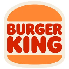
Food & Beverage · 2 points above the Food & Beverage average of 80 (25 logos)
The verdict
The Burger King logo is a highly effective visual asset, excelling in recognition and emotional connection, which are critical for market positioning in the fast-food industry. Its strong design and emotional appeal drive memorability and brand loyalty. However, there are notable gaps in accessibility and cultural inclusivity that, if unaddressed, could limit future market expansion and brand reputation. Strategic adjustments are needed to ensure sustained global relevance and compliance.
Score breakdown
How the Burger King logo scores across the analysis categories.
- Design87
- Psychology82
- Trust87
- Cognitive91
- Market76
- Typography88
- Color64
- Cultural80
Strengths and weak spots
What works
The logo's primary strengths lie in its exceptional memorability and immediate brand recognition, driven by the clear visual metaphor of a burger. Its warm, inviting color palette and friendly, rounded typography create a strong emotional connection, fostering a sense of approachability and comfort. The design is highly scalable and adaptable across various media, maintaining its impact and legibility.
Where it could improve
Areas for improvement include enhancing color contrast for better accessibility, particularly for text against background elements. The cultural sensitivity score indicates potential for refinement to ensure broader global appeal without negative associations. While friendly, the logo could also explore ways to subtly convey a sense of premium quality or innovation to elevate brand perception beyond just 'casual'.
If this were your logo, we'd suggest
- Improve Color Contrast for Accessibility
- Refine Color Palette for Cultural Inclusivity
- Introduce Subtle Premium Cues
- Optimize Typography for Digital Clarity
What the analysis found
Positioning
The logo's direct visual metaphor of a burger bun, combined with warm, appetizing colors, positions Burger King as a classic, approachable fast-food provider. It clearly communicates the core product and brand personality, aligning well with industry expectations for casual dining. The design's friendly aesthetic helps differentiate it from more aggressive or overly modern competitors.
Trust
The logo's established, classic design and clear communication foster a sense of reliability and familiarity, contributing to a solid trust score. The rounded, legible typography and harmonious color scheme project an image of a dependable and honest brand. Its long-standing presence in the market further reinforces professional credibility.
Recognition
With its distinctive 'burger bun' shape and bold, clear typography, the logo achieves exceptional recognition. The high saliency of the brand name ensures it's the first thing noticed, while the simple, iconic visual metaphor makes it highly memorable. This design facilitates rapid processing and recall, crucial for a brand in a competitive, high-volume industry.
Emotion
The warm color palette of orange and red, combined with soft, rounded shapes, evokes feelings of comfort, hunger, and happiness. This creates a strong emotional connection, making the brand feel inviting and satisfying. The logo's friendly aesthetic contributes to a positive emotional impact, encouraging a sense of familiarity and enjoyment.
Design
The logo demonstrates strong design principles with high symmetry and good figure-ground balance, contributing to its perceptual harmony. Its simplicity and clear visual hierarchy ensure scalability across various platforms. However, the color contrast ratios fall short of accessibility standards, indicating a need for design refinement to improve inclusivity.
Brand personality
The Burger King logo primarily embodies 'Sincerity' (85/100) through its down-to-earth, wholesome, and cheerful aesthetic. The rounded, organic shapes and warm, appetizing color palette of orange and red evoke a sense of comfort and familiarity, aligning with honesty and approachability. The clear, direct visual metaphor of a burger bun reinforces its unpretentious and genuine nature. 'Competence' (70/100) is also present due to its clear legibility, strong recognition, and established brand presence, suggesting reliability and success. 'Excitement' (65/100) is moderately conveyed through the vibrant colors and bold typography, hinting at a spirited and energetic experience, but it's balanced by the overall friendly and classic feel. 'Sophistication' (30/100) and 'Ruggedness' (25/100) are minimally represented, as the design prioritizes broad appeal and comfort over luxury or toughness.
The logo embodies 'The Everyman' archetype through its approachable, friendly, and unpretentious design. The rounded shapes, warm colors, and clear visual metaphor of a burger bun appeal to a broad audience, suggesting a brand that is down-to-earth, reliable, and offers a sense of belonging and satisfaction without exclusivity. It's about simple, good food for everyone.
Color and typography
The combination of vibrant orange and deep red-orange creates a strong emotional impact, primarily stimulating appetite, warmth, and energy. Orange evokes enthusiasm and friendliness, while red-orange adds a sense of urgency and passion, often associated with hunger. The overall effect is inviting, comforting, and stimulating, aligning well with the fast-food experience.
The rounded sans-serif font perfectly matches the brand's personality as a friendly, approachable, and casual fast-food provider. Its soft, organic curves align with the comfort and warmth evoked by the burger bun motif and the overall color palette. This typeface communicates a sense of fun and accessibility, reinforcing the 'Everyman' archetype and inviting a broad audience.
Explore the full Burger King scorecard
Every metric behind the 82/100 — attention prediction, color harmony, typography and more, in the interactive report.
More from the index


Independent analysis. Logo Analyzer is not affiliated with or endorsed by Burger King; all trademarks and logos belong to their respective owners. Scores and commentary reflect one AI model's assessment of the logo's design and are not an official ranking, endorsement, or measure of brand or commercial success.