Logo Score Index · #403 of 487
Buick Logo Analysis
Buick's logo signals heritage and trust but risks appearing dated, hindering emotional connection and broader market appeal.
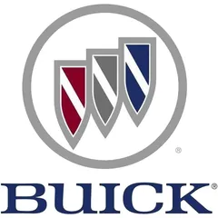
Automotive · 6 points below the Automotive average of 83 (76 logos)
The verdict
The Buick logo effectively projects strong professional credibility and a sense of established heritage, scoring well in trust and positioning. However, its emotional engagement and modern appeal lag, potentially limiting its connection with evolving consumer preferences. Strategic updates could enhance emotional resonance without compromising its foundational strengths.
Score breakdown
How the Buick logo scores across the analysis categories.
- Design81
- Psychology63
- Trust85
- Cognitive77
- Market73
- Typography87
- Color70
- Cultural90
Strengths and weak spots
What works
The logo's primary strengths lie in its strong professional credibility and clear communication of heritage and stability, reinforced by its classic serif typography and shield emblem. Its high cultural sensitivity ensures broad acceptance, and the overall symmetry contributes to a harmonious and trustworthy appearance. The design also demonstrates good memorability and recognition speed, making it easily identifiable.
Where it could improve
Key areas for improvement include the color contrast ratio, which fails WCAG standards and could hinder accessibility. The emotional impact is somewhat muted, potentially limiting deeper customer connection. While timeless, the design could benefit from subtle updates to enhance modern appeal without sacrificing heritage. Additionally, the cognitive load, while moderate, could be slightly optimized for faster processing.
If this were your logo, we'd suggest
- Improve Color Contrast for Accessibility
- Infuse Subtle Emotional Warmth
- Modernize Typography for Freshness
- Optimize Shield Overlap for Clarity
What the analysis found
Positioning
The logo's classic serif font and shield emblem clearly position Buick as a brand with heritage, authority, and reliability. It aligns well with the automotive industry's emphasis on safety and established quality, though its traditional aesthetic might not resonate with consumers seeking cutting-edge innovation.
Trust
The structured design, symmetrical composition, and formal typography contribute significantly to a high trust score. The shield motif inherently suggests protection and dependability, fostering a sense of security and confidence in the brand. The deep blue color further reinforces reliability.
Recognition
The distinct three-shield emblem and clear brand name ensure good recognition speed and memorability. The consistent visual elements create a strong brand identity, making it easily identifiable across various platforms, despite a moderate cognitive load due to the emblem's details.
Emotion
While conveying stability and professionalism, the logo's emotional impact is somewhat subdued. The cool color palette and formal shapes evoke respect rather than excitement or passion, potentially limiting deeper emotional connections with consumers who seek more dynamic or aspirational brand experiences.
Design
The logo demonstrates strong design principles with high harmony and symmetry, contributing to a visually pleasing and balanced aesthetic. However, the low color contrast ratio is a significant design flaw, impacting accessibility and potentially perceived quality. Its scalability is good, but the complexity could be simplified for very small applications.
Brand personality
The Buick logo strongly projects 'Competence' (85) through its structured shield emblem, formal serif typography, and the use of blue and gray colors, all signaling reliability, intelligence, and success. 'Sophistication' (75) is also evident in its elegant composition and classic aesthetic. 'Sincerity' (55) is present but less dominant, as the formality slightly overshadows warmth. 'Excitement' (45) is relatively low, as the design prioritizes stability over daring or imaginative elements. 'Ruggedness' (30) is the least prominent, as the logo's refined nature contrasts with any outdoorsy or tough associations.
The logo strongly embodies 'The Ruler' archetype through its shield imagery, formal typography, and structured composition. The shields symbolize authority, protection, and a legacy of leadership, while the deep blue and gray colors convey stability, control, and sophistication. This aligns with a brand that aims to offer a sense of security, status, and mastery to its customers, positioning itself as a leader in its domain.
Color and typography
The color palette primarily evokes feelings of trust, stability, and professionalism due to the dominant dark blue and gray. The deep red adds a subtle touch of energy or passion, but the overall impression is one of seriousness and reliability rather than high emotional arousal or excitement. It's a more cerebral and reassuring emotional impact.
The classic serif font perfectly matches the brand's personality of heritage, reliability, and professionalism. It conveys a sense of tradition and established quality, reinforcing the trustworthiness and enduring nature associated with Buick. The font's formality aligns well with the 'Ruler' archetype.
Explore the full Buick scorecard
Every metric behind the 77/100 — attention prediction, color harmony, typography and more, in the interactive report.
More from the index


Independent analysis. Logo Analyzer is not affiliated with or endorsed by Buick; all trademarks and logos belong to their respective owners. Scores and commentary reflect one AI model's assessment of the logo's design and are not an official ranking, endorsement, or measure of brand or commercial success.