Logo Score Index · #282 of 487
Atari Logo Analysis
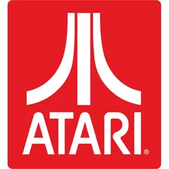
Atari's iconic logo delivers strong recognition and emotional impact, but its limited cultural inclusivity and accessibility pose market expansion risks.
Entertainment · 1 point below the Entertainment average of 82 (83 logos)
The verdict
The Atari logo, a beacon of recognition and emotional excitement, effectively captures attention and fosters strong brand loyalty. While its iconic design ensures high memorability and scalability, the brand faces challenges in cultural inclusivity and color accessibility that could limit broader market penetration. Strategic adjustments to color usage and a deeper understanding of global perceptions are crucial to sustain growth and reinforce its pioneering legacy.
Score breakdown
How the Atari logo scores across the analysis categories.
- Design88
- Psychology83
- Trust84
- Cognitive91
- Market78
- Typography88
- Color60
- Cultural77
Strengths and weak spots
What works
The logo's primary strengths lie in its exceptional memorability and scalability, driven by its simple, iconic design and strong color contrast. Its high symmetry and geometric forms contribute to a sense of stability and professionalism, while the vibrant red evokes excitement and energy, aligning well with the entertainment industry. The design's timeless quality ensures long-term relevance.
Where it could improve
Areas for improvement include its limited cultural inclusivity due to the strong red color's negative associations in some regions, and its moderate color preference score which suggests it might not universally appeal. The lack of color diversity could also be seen as a missed opportunity for richer emotional expression. Additionally, the WCAG contrast ratio fails, indicating accessibility issues for visually impaired users.
If this were your logo, we'd suggest
- Enhance Color Accessibility for WCAG Compliance
- Explore Secondary Color Palette for Brand Extensions
- Conduct Targeted Cultural Market Research
- Refine Typography for Modern Appeal
What the analysis found
Positioning
The logo's bold red and abstract, almost futuristic symbol, combined with its historical context, perfectly position Atari as a pioneer and innovator in the entertainment industry. The geometric shapes and strong lines convey a sense of structured play and technological advancement, aligning with its heritage. However, the retro design style identified by CLIP suggests a potential challenge in positioning for future-forward innovation without careful brand messaging.
Trust
The logo's high symmetry and clear figure-ground balance contribute to a perception of reliability and order, fostering trust. The established nature of the brand, reinforced by its iconic status, lends significant credibility. The bold, clear typography further communicates directness and honesty, building a foundation of trust with consumers who value straightforward communication.
Recognition
With a memorability score of 90 and high attention capture, the Atari logo is exceptionally recognizable. Its simple, high-contrast design and unique 'Fuji' symbol ensure rapid processing fluency and quick recognition, even at a glance. The strong center bias and focused attention points predicted by eye-tracking confirm its effectiveness in guiding the viewer's gaze to key brand elements.
Emotion
The vibrant red color is a powerful emotional trigger, evoking excitement, energy, and passion, which are highly relevant to the gaming experience. The logo's historical significance also taps into nostalgia, creating a strong emotional connection for long-time fans. While the emotional impact is high, the limited color diversity might restrict the range of emotions the brand can convey beyond its core energetic identity.
Design
The logo excels in design quality, boasting high harmony, symmetry, and scalability. Its geometric precision and effective use of visual closure demonstrate strong Gestalt principles. The simplicity of the design ensures it remains effective across various applications, from small icons to large billboards, making it a robust visual asset. However, the poor WCAG contrast ratio is a significant design flaw impacting accessibility.
Brand personality
The Atari logo's dominant personality is 'Excitement' (88/100). This is driven by the vibrant, high-energy red color and the dynamic, abstract 'Fuji' symbol which suggests movement and innovation. The brand's historical association with pioneering video games further reinforces this daring and imaginative quality. 'Competence' (75/100) is also strong, conveyed by the logo's geometric precision, symmetry, and clear, bold typography, signaling reliability and success. 'Ruggedness' (55/100) is present to a lesser extent, perhaps through the bold, blocky letterforms and the brand's association with robust arcade machines. 'Sincerity' (40/100) and 'Sophistication' (30/100) are less prominent; the logo's directness and bold simplicity don't lean towards wholesomeness or upper-class charm.
The Atari logo, with its pioneering history in video games and its abstract, almost futuristic symbol, aligns well with 'The Explorer' archetype. This archetype is driven by a desire for freedom, discovery, and pushing boundaries. Atari, as a brand, introduced new worlds and experiences to consumers, encouraging them to explore digital frontiers. The bold red and distinctive symbol convey a sense of adventure and innovation, resonating with the explorer's spirit of seeking new challenges and experiences.
Color and typography
The vibrant, saturated red of the Atari logo has a strong emotional impact, primarily evoking feelings of excitement, energy, and passion. It's a stimulating color that grabs attention and can create a sense of urgency or playfulness, aligning well with the dynamic nature of video games. The white provides a clean, crisp contrast that enhances the red's intensity, contributing to a bold and direct emotional message.
The custom bold sans-serif font perfectly matches the brand's personality. Its strong, blocky, and slightly rounded letterforms convey a sense of modernity, playfulness, and robustness, aligning with the energetic and pioneering spirit of Atari. The geometric nature of the font complements the abstract 'Fuji' symbol, creating a cohesive and distinctive visual identity that speaks to innovation and entertainment.
Explore the full Atari scorecard
Every metric behind the 81/100 — attention prediction, color harmony, typography and more, in the interactive report.
More from the index


Independent analysis. Logo Analyzer is not affiliated with or endorsed by Atari; all trademarks and logos belong to their respective owners. Scores and commentary reflect one AI model's assessment of the logo's design and are not an official ranking, endorsement, or measure of brand or commercial success.