Logo Score Index · #424 of 487
Alfa Romeo Logo Analysis
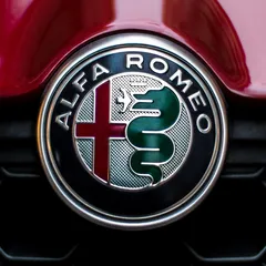
Alfa Romeo's iconic logo commands premium perception but struggles with modern accessibility and global cultural nuances.
Automotive · 7 points below the Automotive average of 83 (76 logos)
The verdict
The Alfa Romeo logo powerfully communicates heritage and premium status, driving strong brand loyalty and a high perception of quality. However, its intricate design and specific color choices present challenges in digital scalability and global cultural inclusivity, potentially limiting broader market appeal. Strategic updates are needed to modernize its visual language without sacrificing its iconic legacy.
Score breakdown
How the Alfa Romeo logo scores across the analysis categories.
- Design78
- Psychology66
- Trust85
- Market85
- Color60
- Cultural76
Strengths and weak spots
What works
The logo's primary strengths lie in its rich historical symbolism, strong emotional impact, and high premium perception. Its unique and complex design ensures high memorability and differentiation within the automotive industry. The bold use of color and iconic imagery effectively communicates passion, performance, and Italian heritage, fostering a deep connection with enthusiasts.
Where it could improve
Areas for improvement include its relatively high visual complexity, which could slightly hinder immediate processing fluency, and its lower cultural sensitivity score due to specific color associations. The WCAG contrast ratio is also a significant weakness, impacting accessibility. While unique, the intricate details might pose challenges for scalability across very small digital applications without losing fidelity.
If this were your logo, we'd suggest
- Improve Color Contrast for Accessibility
- Simplify Intricate Details for Digital Scalability
- Evaluate Cultural Color Perceptions in Target Markets
- Optimize Visual Hierarchy for Faster Recognition
What the analysis found
Positioning
The logo's deep historical symbolism, featuring the Milanese cross and Visconti serpent, firmly positions Alfa Romeo as a brand with rich heritage and Italian passion. The metallic finishes and intricate details align perfectly with a luxury performance automotive segment, differentiating it from more minimalist or overtly futuristic competitors. This strong historical anchoring, however, also means it leans into tradition, which can be a double-edged sword in a rapidly evolving market.
Trust
The classic, established design and the use of a traditional sans-serif font contribute to a high trust score, signaling reliability and a long-standing presence in the industry. The metallic sheen and detailed craftsmanship imply quality and precision, reinforcing professional credibility. This visual consistency over decades has built a strong foundation of trust with its dedicated customer base.
Recognition
Despite its complexity, the logo's unique combination of the circular form, cross, and serpent makes it highly memorable and easily recognizable. The distinct color palette, particularly the dark red and green, further aids in quick identification. While the high visual complexity might slightly increase cognitive load, the strong, iconic elements ensure that once seen, it is not easily forgotten, leading to a high recognition speed.
Emotion
The logo evokes strong emotions of passion, power, and excitement, largely driven by the dominant dark red and the dynamic imagery of the serpent. It tells a story of heritage, valor, and performance, appealing to customers' desires for a thrilling and prestigious driving experience. The emotional impact is significant, fostering a deep, almost tribal connection with brand enthusiasts, aligning well with 'The Hero' archetype.
Design
Visually, the logo exhibits good harmony and symmetry, with a balanced composition within its circular frame. The figure-ground balance is effective, ensuring clarity of its intricate elements. However, the high visual complexity and intricate details, while contributing to uniqueness, present challenges for scalability, especially in small digital formats, and contribute to a lower WCAG contrast ratio, indicating design limitations in modern accessibility.
Brand personality
The Alfa Romeo logo strongly embodies 'The Hero' archetype. The prominent red cross, historically associated with valor and protection, combined with the powerful, almost aggressive imagery of the serpent, evokes courage, mastery, and a drive for excellence. The brand's association with racing and performance further reinforces this archetype, suggesting a brand that strives to overcome challenges and achieve victory. It speaks to customers who value strength, determination, and a sense of accomplishment.
Color and typography
Explore the full Alfa Romeo scorecard
Every metric behind the 76/100 — attention prediction, color harmony, typography and more, in the interactive report.
More from the index


Independent analysis. Logo Analyzer is not affiliated with or endorsed by Alfa Romeo; all trademarks and logos belong to their respective owners. Scores and commentary reflect one AI model's assessment of the logo's design and are not an official ranking, endorsement, or measure of brand or commercial success.