industry applicationsbeauty
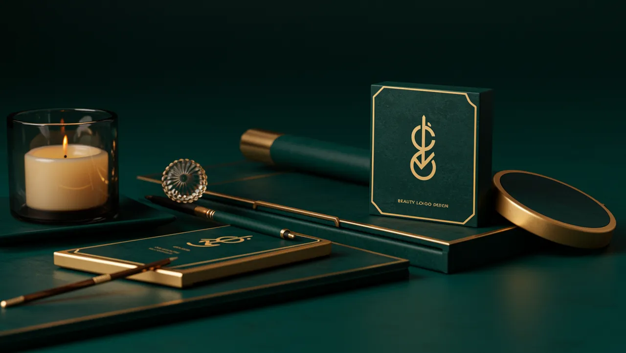
Beauty Logo Design That Captivates at First Glance
Discover stunning beauty logo design ideas that captivate customers instantly. Learn proven strategi...

Create a memorable SaaS logo design that captures your brand identity and wins customer trust in competitive markets. Learn proven strategies.
Create a memorable SaaS logo design that captures your brand identity and wins customer trust in competitive markets. Learn proven strategies.
A SaaS company once told me their logo "worked fine" because it looked like every other tech brand in their category. Blue gradient, geometric sans-serif, abstract swoosh. They couldn't understand why trial signups stalled despite strong ad spend. The problem? Their SaaS logo design was invisible. Not ugly, not broken. Just completely forgettable in a sea of sameness.
Standing out in SaaS isn't about being louder. It's about being the one mark that sticks in a prospect's memory after they've browsed fifteen competitor websites in a single afternoon.
The biggest threat to a SaaS brand isn't a bad logo. It's a generic one. Research on visual distinctiveness shows that consumers need only 400 milliseconds to form an impression of a brand mark Lindgaard et al., 2006. That fraction of a second determines whether your product feels trustworthy, innovative, or forgettable.
Here's what's interesting: SaaS companies cluster around the same visual conventions more than almost any other industry. Open any B2B software directory and you'll see variations of the same blue wordmark repeated dozens of times. Compare that to sectors like pet industry branding, where companies actively seek distinctive, personality-rich marks, or beauty brand identity work, where visual differentiation is treated as a survival skill. SaaS founders tend to play it safe because they equate "professional" with "minimal and blue."
But safe is expensive. When your logo looks like your competitor's logo, every marketing dollar works harder just to create basic recall. You're essentially paying to build someone else's brand awareness.
One thing designers overlook: the SaaS buying cycle is long. Prospects encounter your logo across emails, ads, comparison sites, G2 reviews, LinkedIn posts, and Slack integrations. A distinctive mark compounds recognition across all those touchpoints. A generic one doesn't.
Blue dominates SaaS branding for a reason. It signals trust and reliability Labrecque & Milne, 2012. But when 62% of your competitors also use blue, the trust signal cancels itself out. You're not communicating trustworthiness. You're communicating "I am also a software company."
Think about it this way: cosmetics branding companies figured this out years ago. Glossier's millennial pink, Fenty Beauty's stark black and white, Drunk Elephant's multicolor coding. Each brand carved out a color territory and owned it completely. SaaS brands can learn from this playbook.
Consider these alternatives:
The goal isn't to avoid blue entirely. It's to make a deliberate choice rather than a default one. Run a logo analysis to see how your current color palette performs against competitors in your specific category. You might discover your "safe" choice is actually costing you distinctiveness.
Your typeface communicates your product philosophy before anyone reads a single word of copy. Rounded, friendly sans-serifs suggest ease of use. Sharp geometric fonts signal precision. Custom letterforms hint at craft and attention to detail.
I've seen this mistake countless times: a SaaS startup picks a typeface because it looks "clean" on Dribbble, without considering what it says about their product. A cybersecurity platform using bubbly rounded type sends a confusing signal. A children's edtech tool in rigid Helvetica feels cold.
Quick reality check: you don't need a fully custom typeface. Modified letterforms can be just as effective. Slack's slight tilt on the hashtag symbol. Spotify's subtle letter spacing. Small typographic moves create memorability without the cost of a full custom font project.
What should you do? Audit your typeface against three questions. Does it match your product's personality? Is it legible at 16px on a browser tab? And does it look distinct from the top five competitors in your space? If the answer to any of these is no, it might be time to refresh your logo.
This is where it gets tricky. Early-stage SaaS companies face a genuine strategic dilemma. Should you invest in an abstract icon, or let your wordmark carry the brand?
The honest answer depends on your distribution model. Product-led growth companies with browser extensions, mobile apps, and integrations need a strong icon. It has to work at 16x16 pixels as a favicon and still be recognizable. Notion's "N" block, Figma's interlocking shapes, Linear's angular mark: these succeed because they're simple enough to survive extreme reduction.
Sales-led SaaS companies can often get away with a strong wordmark alone, at least in the early years. Salesforce didn't need its cloud icon to build initial traction. The name did the heavy lifting.
Worth noting: industries like animal logo design and pet brand logo design almost always benefit from figurative marks because the subject matter is inherently visual and emotional. SaaS products rarely have that luxury. Your "product" is invisible, which makes the abstraction challenge harder.
If you do create an icon, test it ruthlessly. Shrink it to favicon size. Put it on a dark background. Place it next to five competitors. Does it hold up? A neuroscience-backed analysis can reveal whether your icon creates genuine neural distinctiveness or just adds visual noise.
A great SaaS logo design means nothing if it's applied inconsistently across your product ecosystem. Your logo appears in your app's top-left corner, in email signatures, on invoices, inside partner directories, across social media avatars, and embedded in customer dashboards. Each touchpoint either builds or erodes recognition.
Research on brand consistency shows that consistent presentation across platforms increases revenue by up to 23% Lucidpress, 2019. For SaaS companies with dozens of digital touchpoints, this matters enormously.
Create a simple but strict usage system:
The companies that build real brand equity treat their logo like a product feature, not an afterthought. They version-control their assets, document usage rules, and audit consistency quarterly. If your brand appears across multiple products or sub-brands, enterprise brand analysis can help you identify where consistency breaks down.
The SaaS logos that endure share three traits. They're simple enough to draw from memory. They carry a subtle conceptual layer that rewards a second look. And they feel inevitable, like no other shape could represent that product.
Dropbox's open box. Airbnb's bélo (which works for a marketplace, not traditional SaaS, but the principle holds). Stripe's slightly italicized wordmark with its bold weight. None of these are complex. All of them are unmistakable.
The conceptual layer matters more than most founders realize. When your logo contains a small "aha" moment, people remember it and talk about it. That's free word-of-mouth marketing baked into your visual identity. This principle of building trust through visual identity applies across industries, but it's especially critical in SaaS where switching costs are low and brand loyalty is fragile.
So what does this mean for your brand? Stop optimizing for "looks professional" and start optimizing for "impossible to confuse with anyone else."
Early-stage startups should budget $2,000 to $10,000 for a quality logo and basic brand system. Avoid spending $50+ on a logo contest, but also don't blow $50,000 before product-market fit. Invest more heavily once your positioning stabilizes and you're scaling marketing spend.
Almost never. Descriptive logos (like a chat bubble for a messaging tool) become limiting as your product expands. Focus on creating a distinctive, memorable mark that carries your brand personality rather than illustrating a feature that might change next quarter.
Most successful SaaS brands refresh every 4 to 7 years, with minor refinements more frequently. If your company has pivoted, merged, or expanded into new markets, that timeline accelerates. Watch for signs your logo needs a refresh like poor favicon performance or brand confusion in competitive comparisons.
AI tools are useful for early exploration and moodboarding. They're poor at creating strategically sound, legally defensible final logos. Use them for inspiration, then work with a designer who understands SaaS positioning and competitive differentiation to create your actual mark.
Your SaaS logo is working for or against you every time a prospect encounters your brand. If you're unsure which one it is, analyze your logo with our neuroscience-backed platform and get a clear, data-driven read on how your mark performs on distinctiveness, trust, and recall. The insights might surprise you.
Discover stunning beauty logo design ideas that captivate customers instantly. Learn proven strategi...
Discover how AI analysis transforms travel logo design into stunning visual identities. Learn expert...
Learn how construction logo design builds client trust and establishes your brand. Discover proven s...
Get a free scientific analysis with 550+ metrics across perception and design.
Try Free Analysis