
industry applicationsfintech
Building a Fintech Brand Identity That Converts
Create a powerful fintech brand identity that converts customers and builds trust. Learn proven stra...
Learn how to build a strong ecommerce brand identity that stands out online. Discover proven strategies to create lasting customer loyalty and grow your busi...
Learn how to build a strong ecommerce brand identity that stands out online. Discover proven strategies to create lasting customer loyalty and grow your busi...
A pet supply brand I worked with last year had everything going for it: great products, competitive pricing, fast shipping. But their conversion rate was abysmal. The culprit? A generic paw-print logo slapped on a template storefront that looked identical to dozens of competitors. Their ecommerce brand identity was essentially invisible. Within three months of a full visual rebrand, their repeat purchase rate jumped 34%. That's not magic. That's what happens when your brand actually means something to the people buying from you.
Your logo is the front door, not the whole house. A strong ecommerce brand identity encompasses every visual and emotional touchpoint a customer experiences, from the favicon in their browser tab to the unboxing moment on their doorstep. The brands that win online understand this distinction.
Research from the Journal of Business Research found that visual brand consistency across platforms increases revenue by up to 23% Luchs et al., 2015. That's because consistency builds recognition, and recognition builds trust. Quick reality check: when was the last time you bought from a site that looked thrown together?
Think about Chewy. Their brand identity goes far beyond the logo. The playful typography, warm color palette, hand-drawn illustration style, and conversational tone all work together. Every element signals the same thing: "We love pets as much as you do." That coherence is what separates a brand from a store.
For your own ecommerce business, start by auditing every customer touchpoint. Your logo, product pages, email templates, packaging, social profiles, and even your 404 page should feel like they belong to the same family. If you're unsure where gaps exist, a thorough logo analysis can reveal inconsistencies you've been too close to notice.
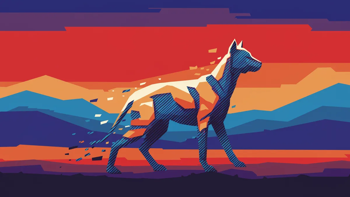
Animal logo design carries unique psychological weight. Humans are neurologically wired to respond to animal imagery, a phenomenon researchers call biophilia Wilson, 1984. Pet industry brands can use this to their advantage, but only if they avoid the most common traps.
Here's what's interesting: the most successful pet brand logo design rarely depicts a photorealistic animal. Instead, it abstracts or stylizes the animal to create something ownable. BarkBox uses a simple, geometric dog silhouette. Stella & Chewy's features an illustrated dog that feels hand-crafted. These logos work because they're distinctive enough to be remembered and simple enough to scale across packaging, apps, and social media.
One thing designers overlook: the species you choose matters enormously. Dogs signal loyalty and warmth. Cats suggest independence and sophistication. Birds can imply freedom or aspiration. Your choice should align with your brand's personality, not just your product category.
If you're building a pet industry branding strategy, consider these principles:
Beauty brand identity operates under different rules than almost any other ecommerce category. Your visual identity isn't just representing your products; it IS the product experience. Customers buying skincare or cosmetics are purchasing a feeling, an aspiration, a version of themselves. Your brand's visual language needs to deliver that before they ever open a jar.
Glossier understood this better than anyone. Their millennial pink, clean sans-serif typography, and generous white space didn't just look good. It communicated a philosophy: beauty should be effortless, approachable, democratic. Every visual choice reinforced that message.
Cosmetics branding that converts online tends to share a few traits. Minimalist design that photographs well on screens. A restrained color palette (usually two to three colors maximum). Typography that balances elegance with readability at small sizes. And packaging design that's inherently shareable on social media.
But here's the catch: minimalism without meaning is just emptiness. I've seen dozens of indie beauty brands adopt the "clean girl aesthetic" without understanding what it communicates. If your brand is about bold self-expression and your identity whispers, you've got a disconnect that no amount of Instagram ads will fix.
A useful exercise is to compare logos of the top five brands in your specific beauty niche. Look for visual patterns, then ask yourself: where is the white space in this market? Not on the page, but in the positioning. That's where your brand identity should live.
Most ecommerce founders obsess over making a great first impression. That matters, obviously. But the real value of brand identity is what happens on the second, fifth, and fiftieth encounter. Recognition is the compounding asset.
A study published in the Journal of Consumer Psychology demonstrated that mere repeated exposure to a brand's visual elements increases preference, even when consumers can't consciously recall seeing them Zajonc, 2001. This is the mere exposure effect, and it's one of the most reliable findings in consumer psychology.
So what does this mean for your brand? It means consistency isn't boring. It's strategic. Every time a customer sees your logo on a retargeting ad, an email subject line icon, or a friend's unboxing video, that exposure deposits a tiny amount of trust into their mental account.
Practical steps to maximize recognition:
Worth noting: building trust through visual identity isn't a one-time project. It's an ongoing discipline.
Every ecommerce vertical has visual conventions that customers have learned to decode, mostly without realizing it. Violate these conventions carelessly and you'll confuse people. Use them strategically and you'll communicate credibility in milliseconds.
Pet brands that use earthy, organic color palettes signal premium or natural positioning. Bright, saturated colors with rounded typefaces read as fun, affordable, and family-friendly. In the beauty space, black and gold still connote luxury, while pastels and hand-drawn elements suggest indie or artisanal.
The data tells a different story than many designers expect, though. Research on ecommerce trust signals found that perceived professionalism of visual design was the single strongest predictor of whether a first-time visitor would complete a purchase Fogg et al., 2003. Not price. Not reviews. Visual design.
This doesn't mean every store needs to look like Apple. It means your visual identity needs to match the expectations of your specific audience. A raw, hand-stamped aesthetic might be perfect for an artisanal dog treat brand. That same look would tank conversion rates for a clinical skincare line.
Consider running your current identity through a logo analysis to see whether your visual signals align with what your target customer actually expects. Sometimes the gap between intention and perception is wider than you think. Our sample reports show exactly the kind of insights this process can uncover.
Knowing when to refresh your ecommerce brand identity is as important as building it right in the first place. Rebranding too often destroys the recognition you've worked to build. But clinging to outdated visuals can make your brand feel stale, or worse, untrustworthy.
Some clear signals: your logo doesn't render well on mobile (a problem for many brands designed before 2015). Your visual identity no longer reflects your product range or target audience. Competitors have adopted a similar look and you're losing distinctiveness. Or you're expanding into new categories where your current branding sends the wrong message.
I've seen this play out repeatedly in pet industry branding. A company starts selling dog toys, builds a playful brand identity around that, then expands into premium pet nutrition. The bouncy, cartoonish logo that worked for toys actively undermines credibility in the health-focused space. That's a legitimate reason to evolve.
If you're wondering whether it's time to refresh your logo, approach the decision with data, not just gut feeling. Survey your customers. Run A/B tests on key landing pages. And get an objective logo evaluation before committing to a full redesign, because sometimes the fix is smaller than you think.
Focus on three elements first: a clean, scalable logo, a defined color palette (two to three colors), and one or two brand fonts. Free tools like Coolors and Google Fonts can help. Spend your budget on the logo itself, since everything else builds from that foundation.
Absolutely. Animal symbolism translates across industries. A fox can represent cleverness for a tech brand. An owl works for education. A lion signals strength for financial services. The key is choosing an animal whose cultural associations match your brand's personality and values.
Major rebrands typically happen every 7 to 10 years. Minor refreshes (updating typography, refining color values, simplifying your logo) can happen every 3 to 5 years. Avoid changing your core identity more frequently than that, or you'll sacrifice the recognition you've built.
Yes, but the visual cues are completely different. Luxury beauty brands lean on restrained palettes, serif typography, and generous negative space. Affordable brands use brighter colors, bolder type, and busier layouts that signal value and energy. Trying to do both simultaneously confuses customers.
Your ecommerce brand identity is either working for you on every page, every ad, and every package, or it's quietly costing you sales. If you're not sure which one it is, that's worth finding out. Analyze your logo with our neuroscience-backed platform and see exactly how your brand identity performs where it matters most: in the minds of your customers.
Create a powerful fintech brand identity that converts customers and builds trust. Learn proven stra...
Discover how property brand logo design builds client trust and sets your real estate business apart...
Discover what makes a luxury brand logo truly prestigious. Learn design principles that elevate your...
Get a free scientific analysis with 550+ metrics across perception and design.
Try Free Analysis